Introduction
The website is for a local small business store that aims to highlight its speciality while providing detailed information about the products, people involved, opening hours, contact information, and location. Unlike other websites that are primarily concerned with selling their products or services, this one is intended to introduce the company to potential customers. The website has a simple and clean design that includes a header section with the company name, logo, and navigation menu, allowing visitors to easily access important information. Furthermore, the website’s “About Us” page provides information about the company’s history, mission, and values, emphasizing its emphasis on introducing the company to prospective customers. The report will assess the website’s strengths and weaknesses and make recommendations to improve its effectiveness in promoting the organisation.
My Concept For Improvisation
The main goal of the revised version of the small business website project was to improve on the previous design. Rather than starting from scratch, I wanted to incorporate new skills and techniques from my studies, such as SEO, accessibility, responsive images, meta tags, JavaScript, and custom 404 pages. By doing so, I aimed to improve the website’s effectiveness, usability, and accessibility to potential customers.
The revised version has several improvements and optimisations that make it more effective and user-friendly. Here are a few of the key features that were already in place but were improved:
Initial version that were Maintained:
In initial version: https://mhjsab.com/Design-for-Web-Content/small-business-website/index.html
The important aspects like:
- Responsiveness: The website was already responsive, which means it was built to adapt and adjust to different screen sizes and devices. This is an important consideration because it ensures that the website looks and functions properly on all devices, including desktop computers, laptop computers, smartphones, and tablets.
- Image optimisation: The images on the website were compressed and resized to reduce file size and improve load times. This is critical because large images can slow down the website and degrade the user experience.
- Image alt tags: The images on the website already had alt tags, which are descriptions that screen readers read to visually impaired users. This is important for accessibility and can also help with SEO because search engines can use alt tags to better understand the website’s content.
- Proper HTML semantics: The website’s revised version also improves on HTML semantics, ensuring that the website is properly structured and organized in accordance with the most recent web standards. This is beneficial for SEO and can improve user experience by making the website easier to navigate and understand.
Revisited version
Revisited website: https://mhjsab.com/Design-for-Web-Content/small-business-website-revised/index.php
The first step in revising the website was to thoroughly review the existing site and identify areas for improvement.
Marquee:
A redesign of the marquee section was one of the key changes made during the revision process. This section previously featured moving items that were not particularly visually appealing.In the updated version of the website, the marquee section was converted to a list of items to address this issue. This change made the section more visually appealing and easier to navigate for users.
Old version:

Updated Version:

Logo Update:
The logo displayed on the homepage in front of the banner appears pixelated and unclear during the revision process. To address this issue, a new logo that was clean and of high quality was created that provides a more professional and visually appealing experience for users.
Old Version:

Latest Version:

Header Visibility:
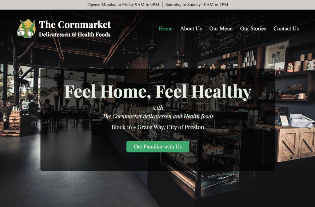
Similarly, the header on the homepage was not properly visible. To address this issue, an overlay was added to the banner section to increase the visibility of the header. This change improved the overall user experience by making it easier for visitors to navigate and accessible experience.
Old version:

New Version:

Integrate Javascript:
In addition, JavaScript was added to the website to improve its functionality by including two significant changes:
- First, a sticky menu was created with JavaScript. This menu appears as the user scrolls up the page and disappears as the user scrolls down past the screen height. This change made the website more user-friendly by making it easier for users to navigate to different sections of the site.
- Second, a mobile menu that shows/hides the menu on click was added. This feature is especially useful for users who access the website via mobile devices because it allows them to navigate the site without having to scroll through a large menu.
Overall responsiveness was checked thoroughly and fixed:
The website’s overall responsiveness was thoroughly tested and corrected. This was done to ensure that the website looked good on all devices, including desktop computers, laptop computers, tablets, and smartphones.
PHP integration
PHP integration was added to the website. This was done in order to help minimize the repetition of code and to make the site easier to manage and maintain. By using PHP, it was possible to create more dynamic and flexible pages that could adapt to the needs of the user.
One of the key advantages of PHP was the ability to check which page was active and adjust the site accordingly.
Another benefit of using PHP was the ability to get relative paths and include partials. This helped to streamline the code and make it more modular, which in turn made it easier to manage and write clean code.
Custom Error page
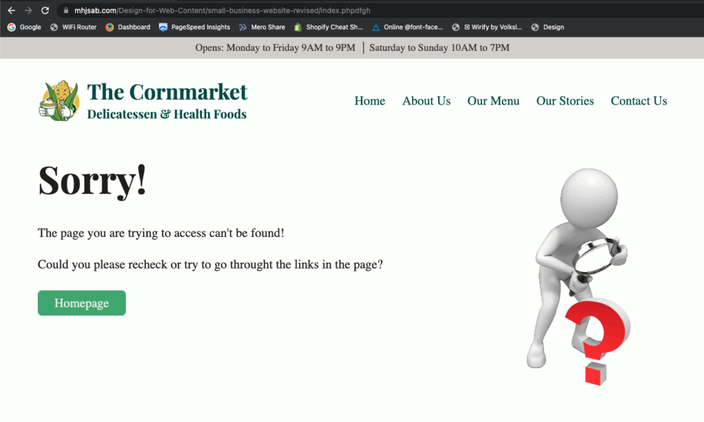
For the website, a custom error page was created. This was accomplished by editing the.htaccess file, a configuration file used by web servers to control how they respond to requests.
It was possible to specify a custom error page that would be displayed to users if they encountered an error while attempting to access the site by editing the.htaccess file. This contributed to a better user experience and ensured that visitors were not presented with a confusing or unhelpful error message.

Error Page:
Responsive image:
The website’s banner image was optimized for mobile devices by using two separate images for larger screens and mobile devices. This was done to improve page speed on mobile devices, which can be slower than desktop computers.
To accomplish this, two distinct images were created: one for larger screens and another for mobile devices. For desktop computers and larger screens, the larger image was used, while the smaller image was used for mobile devices. This helped to reduce the image’s file size and improve page speed on mobile devices.

SEO
Several steps were taken to improve the search engine optimisation (SEO) and social media sharing of the website. One of the most significant changes was the addition of unique meta tags and descriptions for each page, which helped search engines better understand the website’s content.
The website now includes Open Graph (OG) images in addition to meta tags. These images are intended for social media sharing on platforms such as Twitter, Facebook, and LinkedIn. Users who share the website on social media will see a customised and visually appealing image in their posts if an OG image is provided.
Accessibility:
To ensure accessibility, the HTML semantic was preserved in the website, and all images on the site had alt text. Unneeded divs and elements have been removed, and aria labels have been added to the navigation. The site’s readability was improved by rechecking the colors, and paragraphs were kept concise while still providing adequate information.
Google Analysis
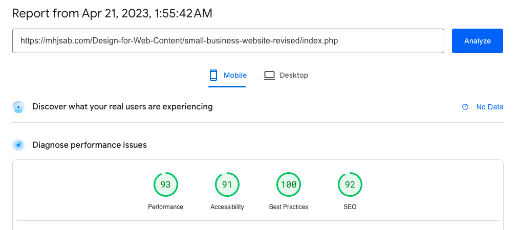
Following the implementation of all changes, the website was thoroughly tested using Google analysis to ensure optimal site speed, SEO, and overall performance. Image sizes and content were improved to improve the user experience and boost the website’s SEO.
Dektop version:
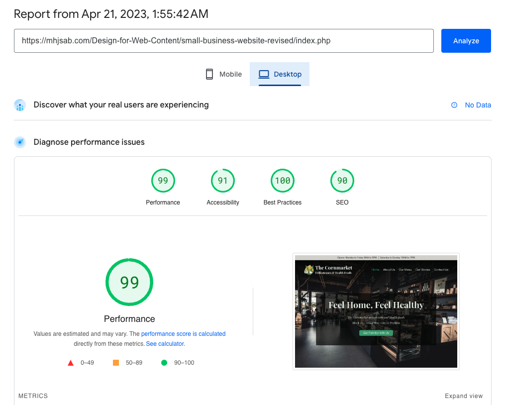
Mobile version
